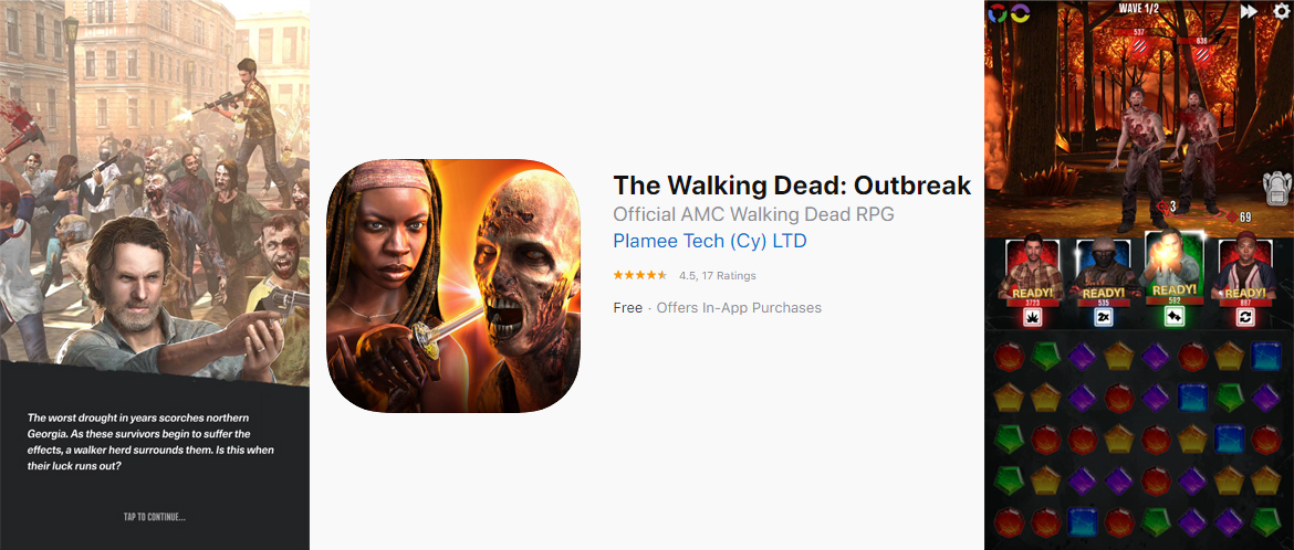
The Walking Dead: Outbreak
The Challenge - This title was built off of the tech and design base developed in our previous release, Pacific Rim: Breach Wars. While this gave us a solid foundation to build off of, there were plenty of challenges to overcome. What seemed like minor client preferences caused significant changes to some key game systems. And, of course, the team wanted to iterate on the design, taking into account lessons that were learned from previous projects.
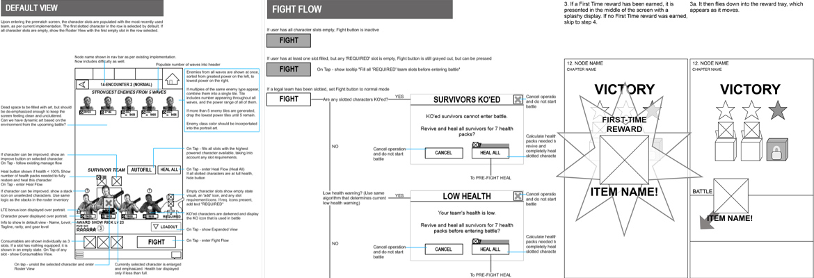
Redesigning the Battle
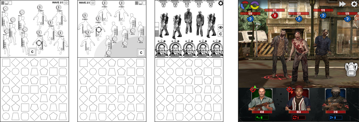
This game builds off of the match-3 style core battle mechanic we had already built for previous projects. However, a few goals were introduced that significantly altered the design of the system. Those goals were:
- support 5 enemies and 5 player characters on the board at once
- increase the pace and excitement of battle
- remove systems that weren't working (mainly the pin/domination meter)
As I set out prototyping layouts for the battle scene, it quickly became apparent that the existing L/R oriented side view layout that we already had going was not going to work out. I redesigned it so the player characters were arrayed across the screen as portraits, with the enemies vertically opposed at the top of the screen, much like you see in many other match-3 battlers. This was met with disappointment from the client, who felt that this reduced the possibility for impressive character art. However, after the fact, the team felt confident that it was the right call to make the best overall game experience possible.
In order to make the gameplay snappier, the design team removed one of the gem colors and reduced the height of the gem board, meaning the gems would cascade more often and be easier to match. This, in combination with the removal of the domination meter, left significantly more room on the screen, which I was able to use to good effect to emphasize the characters and their UI and ability effects.
Onboarding
Studio leadership, as well as I personally, had felt to this point that onbaording was a weakness of the studio. When it came time to consider the onboarding for this project I took it upon myself to jump in with both feet and try to wrangle this system into shape. I wanted to fundamentally shift how we thought about onbaording as a studio, and at that I believe I was successful. With the help of the design and product teams, I set several goals for this process:
- significantly improve our retention KPI's, in particular D0 and D1
- address the user motivation and retention aspect of onboarding, not just the teaching aspect
- as much as possible, remove the stigma of tutorials as a chore, or a friction that gets in the way of the user's intention to jump in and enjoy the game
- Use academic knowlege to present onboarding in a way that corresponds to and takes advantage of the way people perceive and think
I started by creating a high level study of the psychology of onboarding and a breakdown of how existing or potential systems play to these strengths and weaknesses. This sort of academic treatise is an unusual step to take, especially during the fast paced months of an actual production schedule, but I felt it was necessary in order to shift the culture around this topic. This study covered the following topics:
- user motivation, including motivators vs inhibitors, extrinsic vs intrinsic motivation
- self determination theory, which addresses motivation across the 3 axes of autonomy, competence, and relatedness
- factors that affect a user's ability to learn and comprehend, including forgetting, repetition, cognitive load, and inherent meaning
- proposed design pillars for the onboarding process
Based on this work, I then designed out a number of conceptual systems that could be used to accomplish certain goals, or to address specific problems. Below are examples of a few of those systems:
- Simon Says: this is a standard hand-held tutorial which has been designed to make use of repetition to instill the key lesson. The first instance of the tutorial would teach point A, the second would teach point A & point B, and the third points A, B, & C.
- Contextual Prompts: by watching the user's behavior, we could detect whether they were using key systems at the appropriate times. If the were not using the systems, we could trigger prompts that addressed the users needs at the right time, without causing irritation for users that didn't need them.
- Restricted Access: by completely hiding content the users are not ready for yet, we reduced cognitive load while also helping the user focus on what is meaningful to them.
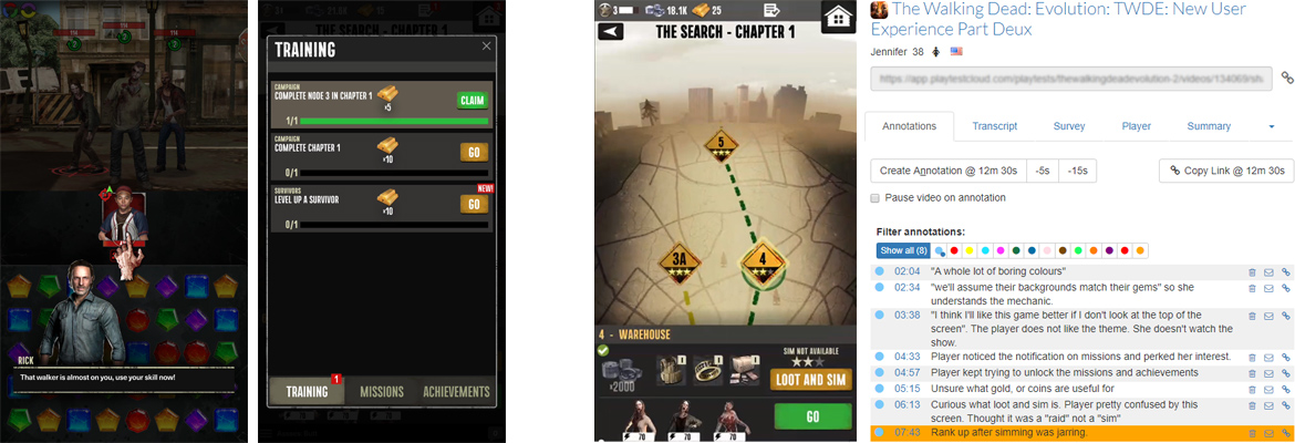
- Tutorial Missions: many individual system tutorials were put into a missions system, with rewards for completion. This way, users could engage with the onboarding when they wanted to, giving them a sense of control over their experience, and would gain a reward, which helped with motivation. Additionally, users who already understood the systems would complete the missions without engaging the tutorial at all.
Once the systems were in place, we used several rounds of user testing to validate and refine our onboarding design and execution. This consisted of outsourced playtests of individuals within targeted demographics, which were recorded and annotated. We also used analytics to measure engagement and to determine our progress against our target KPI's.
As a result of this robust process, we were able to increase our D1 retention by about 8% over our previous title, which used the same engine and similar systems.
Testing Analysis
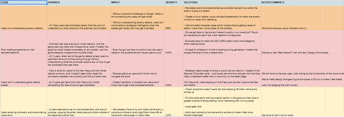
As discussed under the onboarding topic, we used multiple rounds of user playtests to gather feedback on our systems. I took it upon myself to build a review template, which I filled out after carefully watching and annotating all the recorded tests. By compiling the feedback and breaking it down into an easily digestible format that highlighted the key takeaways, production and design teams were much more empowered to make use of the results effectively, and to schedule the appropriate responses into the release cadence. The template broke down issues by
- Evidence - defend why we think this issue exists
- Impact - why do we care about this issue
- Severity - color coded to easily highlight areas of concern
- Solutions - some initial thoughts on how to address the issues
- Positive Callouts - it's just as important to note the successes revealed by testing. If we know what is working, we can build on it, as well as ensuring it doesn't get lost in future development
Prototyping and Wireframing
As usual, prototyping and wireframing system designs was the largest part of my involvement on the project. This process would start with a review of the design spec incorporating my feedback from the UX point of view. Then I would create a clickthrough prototype which would be evaluated by design and other stakeholders. Usually there would be several rounds of iteration before I had enough buy-in to consider the design ready. Then I would make a detailed wireframe spec. This spec was used by our visual designer to mock up the screens and produce assets, a process in which I was closely involved, giving frequent feedback. The mockups and wireframes were then delivered for implementation, another process which I watched closely to make sure the implementation hit the intended target. Finally, there would be a team wide review before deciding the feature was ready. If so, it would then be sent to QA in preperation for release.
See sample wireframe here
Conclusion
This project iterated on many systems that existed from earlier projects, allowing us to hone in ever tighter on the game experience we were after. The extra focus on the onboarding system was a big win, which will be carried forward into future projects. The result was a game that performed well in soft launch, meeting or exceeding its target KPI's and giving us great confidence that it will succeed upon release.